
Skill Atlas is an open source team skills mapping dashboard I built for product design managers, leads and teams. It helps teams see the shape of their capability: individual competency profiles, role maturity, current role fit, archetype balance, and AI-augmented design skill.
The idea started long before this version. I had already tried to make designer skills easier to discuss through Google Sheets, Figma files and Figma plugins. The latest version is what happened when AI made it faster to turn that long-running idea into a working product that other teams can clone, customise and run for themselves.
Why I built it
Teams often talk about capability in vague terms. Someone is "strong at strategy", another person is "good with craft", and a team might generally feel like it needs more research, facilitation or systems thinking. Those conversations are useful, but they can be hard to turn into a shared view.
The original goal was simple: make team capability visible enough to discuss without turning people into scores on a spreadsheet. I wanted a way to help managers and teams spot strengths, ambitions and gaps while keeping the conversation practical and human.
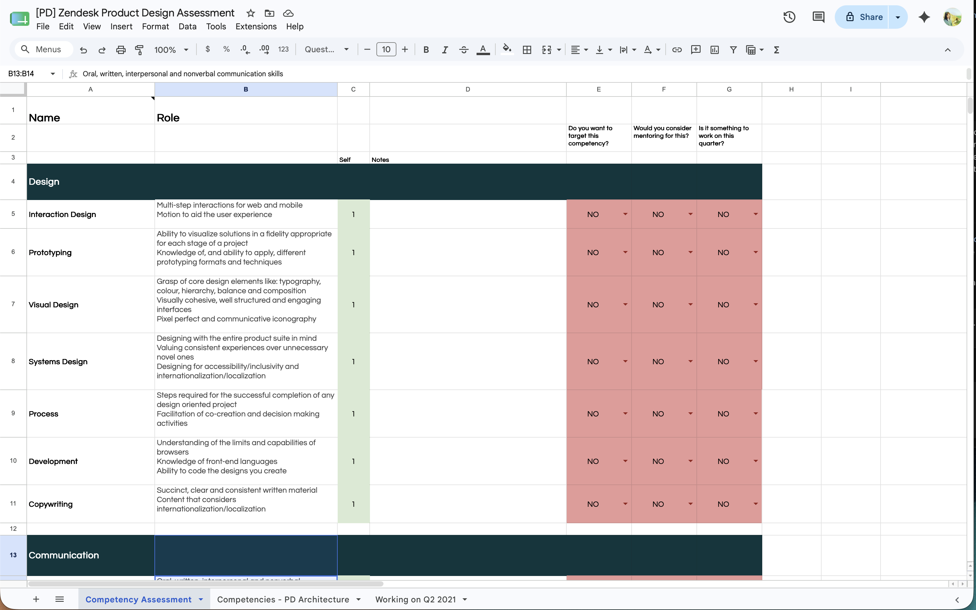
One of the first versions I made was a Google Sheets assessment while I was at Zendesk. It became a shared template for our product design team there: a practical way to list competencies, add self-ratings, capture notes, and flag areas someone wanted to target, mentor on, or improve that quarter.
The long version: from canvas to tool
This idea has moved through a few formats over the years. Each version solved part of the problem and exposed what was still painful.
Google Sheets at Zendesk
The spreadsheet version made the information structured and easy to update. It worked well as a shared team template because it gave people a familiar place to reflect on competencies, goals and mentoring opportunities.
It was practical, but it still felt like a spreadsheet. The format was good for collecting data, less good for helping people see the shape of a team or making the conversation feel engaging.
Figma Community template
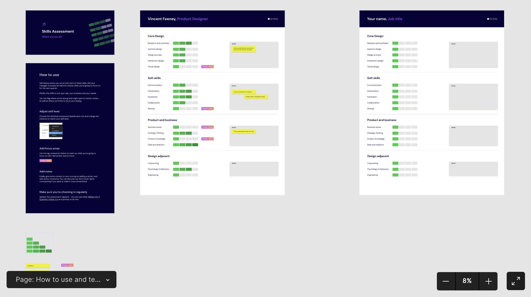
Later, I moved the idea into Figma and shared a file called Product / UX Designer Skills Assessment. The visual canvas made the activity more approachable for designers and easier to use in reflection or team conversations.
More than 2,000 people used that file, which was a useful signal that this was not just a personal management itch. Other designers and managers were looking for better ways to make growth, strengths and gaps visible too.
Figma plugins
I experimented with plugins to make the mapping process more structured. This helped with repeatability, but it still lived inside a design tool, which limited who could comfortably use it and how easily the data could be reused.
What changed with AI
AI shifted the project from a facilitation artifact into something closer to a usable product. Instead of hand-shaping every view, I could use AI to help generate structure, prototype flows, refine components and turn a rough idea into an interactive tool faster than before.
The important part was not that AI replaced the thinking. It reduced the cost of making the thinking tangible. That made it easier to explore versions, test the shape of the experience, and get closer to something another team could actually use, rather than another static template people had to interpret for themselves.
What I built
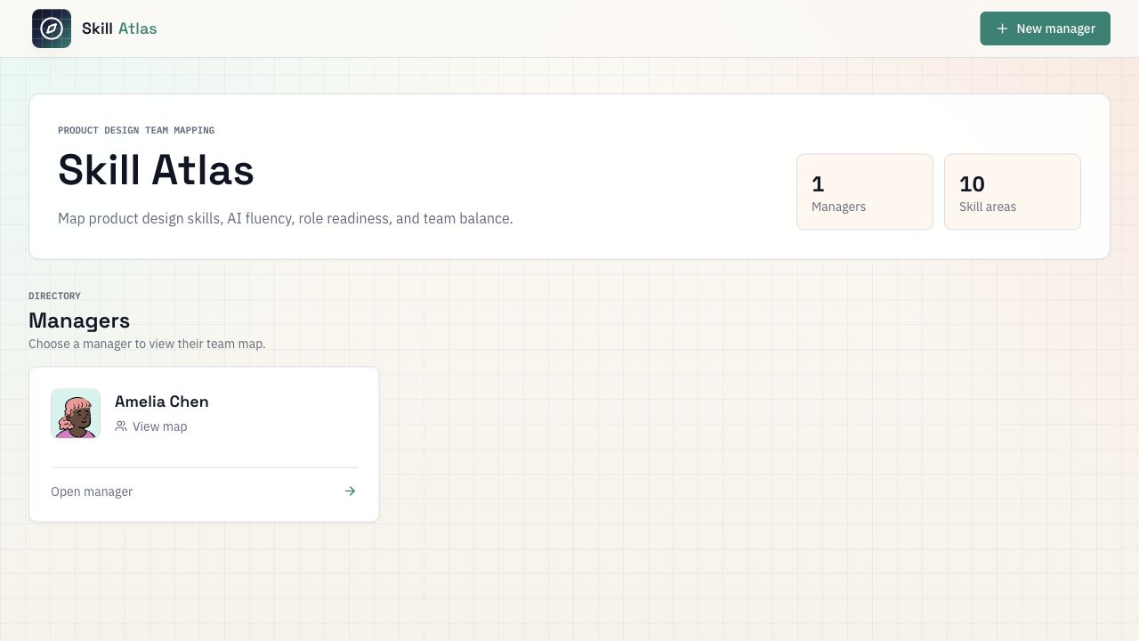
Skill Atlas is built as a practical starter app. It runs locally with a built-in demo dataset, can be deployed as a read-only public demo, and can switch to PostgreSQL persistence when a team wants to keep their own data.
- Managers can view team maps from a directory of manager views.
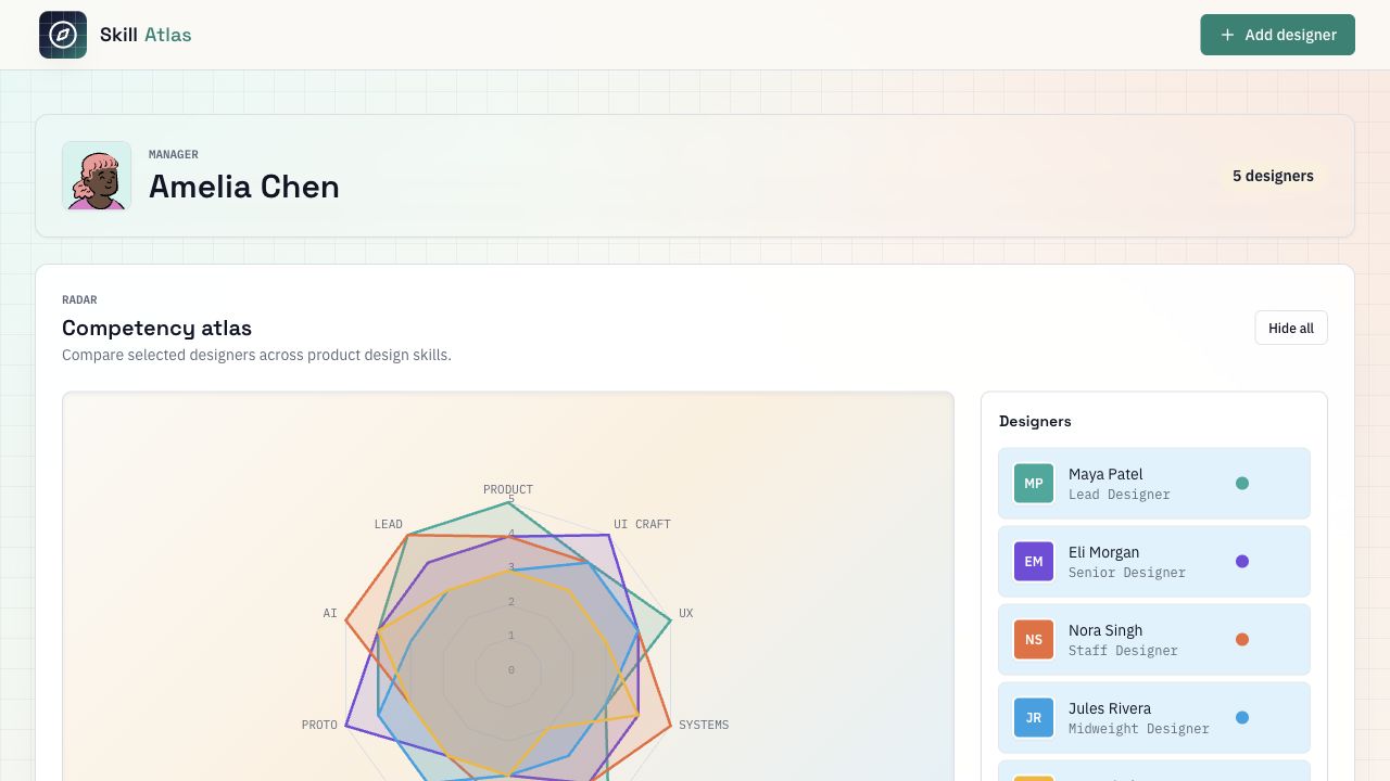
- Designers are mapped across 10 product design skill areas.
- A radar chart compares selected designers across the skill model.
- Role maturity shows how close someone is to the next stage of their current role.
- Role fit highlights whether someone is aligned with current expectations or needs attention.
- Archetypes group people by Craft, Systems and Strategy orientation.
- AI-Augmented Design is treated as a first-class competency, not a side note.
Why open source?
I wanted the project to be useful beyond a polished case study. Skills models are always contextual. A design team in one company may care deeply about systems thinking and stakeholder influence, while another may need to emphasise research, prototyping or AI fluency. Publishing the code means people can take the structure and adapt the model to their own team.
The repo is designed to be cloned and customised. Teams can rename the product, change the skill model, adjust levels and archetypes, replace the visual identity, run with demo data, or connect a database when they want persistence.
What I learned
Skills maps work best when they start better conversations, not when they pretend to be objective measurement systems. The goal is not to reduce people to numbers. The goal is to make invisible patterns visible enough to talk about: where someone wants to grow, where the team is over-indexed, where coaching could help, and where future hiring or project allocation might need to shift.
The format also matters. A spreadsheet makes capability easy to collect. A Figma template makes it easier to discuss. A product gives the information more structure, comparison and continuity. The goal stayed the same: give managers a quick visual they can come back to. Something that shows team status at a glance, but still works when you want to explore an individual or the whole team in more detail.